Yesterday at art association weekly open studio, we had a lesson incorporating printing into a watercolor painting. We gathered various leaves from our yards. I chose some fern leaves and the soft fuzzy leaves of lamb’s ear.
There are just a few steps. First, lightly pencil in your subject. I chose to draw a vase of flowers based on my memories. The paper is wet over the background and allowed to dry to the “low gloss” stage. Next, choose a leaf and paint a few colors on it. I started with yellow, then added stripes of blue. Then the leaf is pressed onto the paper, held in place briefly and removed. In addition to pressing the two shapes of leaves wherever I wanted leaves, I used a paper doily as a stencil, painting through the holes to make a pattern in the foreground. Next, I painted on some small tulips
Here is my painting after the paint had dried, showing these steps completed.
Today I finished the painting. This involved building up color and adding some details to the leaves, the vase and the flowers.
While it is a very simple style, I will call this experiment a success.
Painted on Arches cold press paper with yellow ocher, Winsor yellow, ultramarine blue, alizarin crimson, carbazole violet, transparent orange, and viridian. A little white gouache played up the highlights.
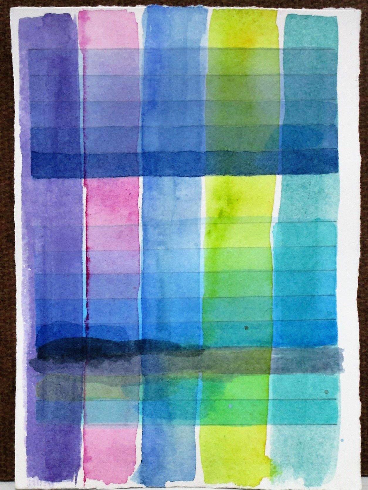
While tidying up my studio the other day, I came across several of my watercolor test swatches. I have three samples, each no bigger than 4 x 6 inches, that were made as I prepared to paint the geometric abstract of the Belize lagoon.
Looking at them with fresh eyes I got the idea of framing the paintings as a group. But first, I would want to work on them some more.
In the language of watercolor, a wash that is painted over existing washes is called a glaze. The term emphasizes the sheer characteristic of this medium. Today I got busy adding some glazes. When the paint had dried, I added a little line work.
Here is what I have so far.
I like the fresh and bright colors and the variety of shapes. But I am wondering if these tiny paintings are finished now. I’m toying with the idea of sewing on them with embroidery thread.
Rather than ending up Dazed and Confused, I believe that I will put this project aside and see how I feel about it tomorrow.
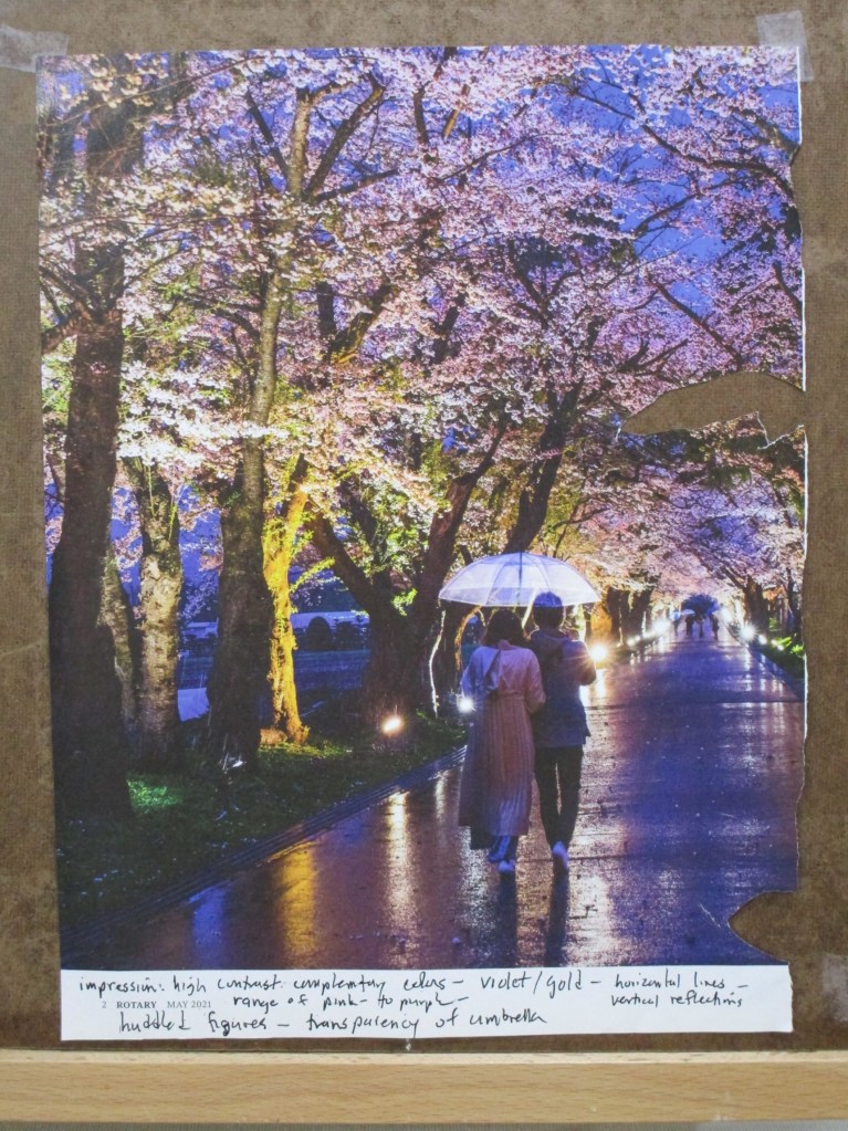
This month I have been participating in an art forum called Sketchbook Revival. For this page of my sketchbook I am following Faith Evans-Sill and her workshop that has us experiment with color and pattern prompted by an image.
I chose to be inspired by a photograph I found in my Rotary Magazine.
For the technique, we are asked to sweep stripes of color across the page, then intersperse shapes and patterns between and among the stripes. I decided to be somewhat more literal in my experiments. I wanted to reproduce the colors and elements that I saw in the photo, especially the trees.
In addition to regular watercolor paint, I worked in some metallic paints to capture some of the shine that’s visible in image. Once everything dried, I made marks with a black micron pen and a few colored pencils.
There were two benefits to the exercise. 1. Splashing the paint around was relaxing and stimulating to my brain. 2. I discovered colors and mixes that were new to me.
If you are interested in Faith Evans-Sill and her class offerings, here is her webpage.
Hi friends! I have been absent for a few weeks while traveling around the country. A large chunk of our travel was in wintery Wisconsin. Despite the cold, snowy and windy weather, I found some inspiration in what we saw. I love the rolling countryside of the Driftless region. And the sand hill cranes. (More on the cranes coming soon.)
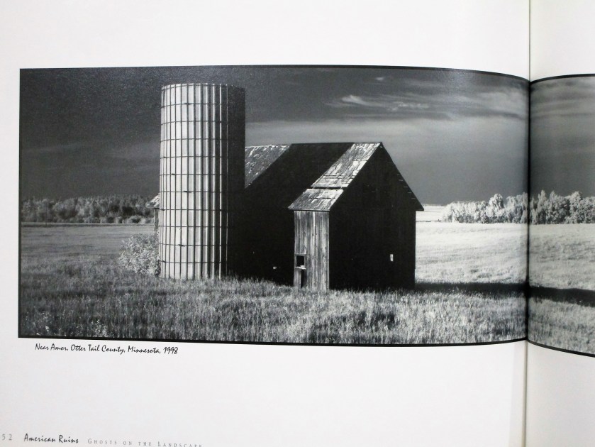
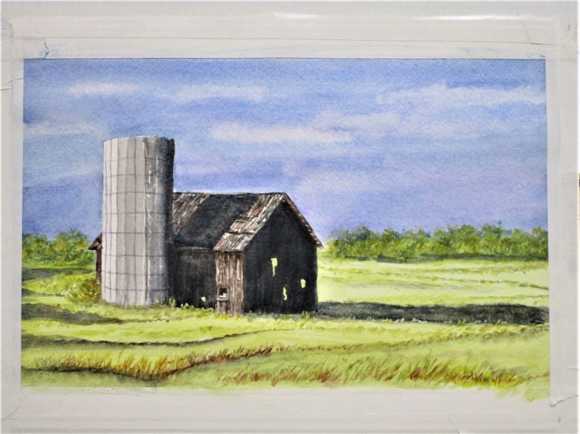
For today I will start with a rural landscape. My re-entry into art started with Wednesday’s Open Studio at the local art association. Every month on the first Wednesday, watercolor artist Cheryl Bryan provides a lesson. This week’s subject was buildings. I chose to paint a barn, in honor of all the lovely barns I saw in WI.
For my reference photo, I turned to American Ruins: Ghosts on the Landscape by Maxwell MacKenzie. A few years back I was blown away by MacKenzie’s formidable photographs of falling down farm buildings on the great plains. My first attempt at rendering one of these images was a few years back when I was learning to draw with pen and ink.
Today I picked this image to paint in watercolor.
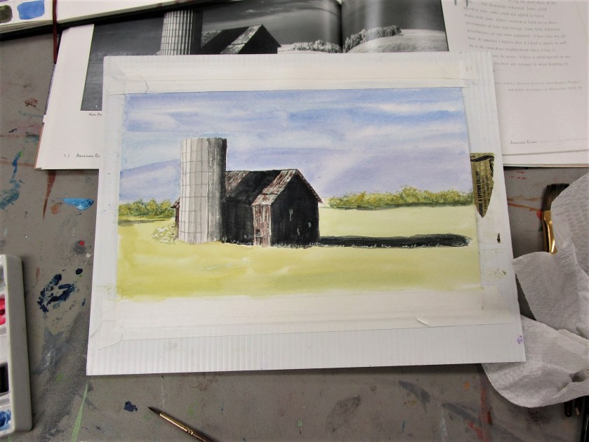
The sketch took me almost no time. I didn’t need to re-scale it to fit my paper, so I did a tracing of the essential lines. I then transferred the tracing to my paper. Next I added masking fluid to retain some of the white spaces (especially those small holes in the old barn.
For more drama, I added a few more holes.
To keep things simple, I chose a limited palette: burnt sienna, cerulean blue, cobalt blue, carbazole voilet and Winsor yellow. Oh, and a little black.
Cheryl’s lesson focused on painting values. She asked us to decide where to use high, medium and low values, assigning one value to background, foreground and subject.
Using a black and white photo made this part easy. I wanted to retain the photographer’s focal point, which was the deep shadows thrown by the silo and barn. My background would be a medium tone and my foreground light. After painting the sky and adding a preliminary wash to the foreground, I painted my subject.
At this point I was stumped on how to proceed. So I showed my work to Cheryl, who gently scolded me for using black paint. Watercolor students are discouraged from using black paint. We are told that it deadens the painting.
I went home and proceeded to wash out as much of the black paint as I could.
Today I returned to the painting. First, I decided that the sky was too light. Masking the top of the silo and barn, I added a glaze of cobalt blue to the sky. Then I painted glazes over the three areas of black paint using blue, brown and yellow.
At this point I removed all the masking fluid and turned to the foreground. Now, I live on a prairie. I spend many, many hours traveling on roads that cross the prairie. You would imagine that it would be easy for me to fill my painting with prairie grasses. But that expansive area of yellow paint just sat there and mocked me.
To get over my artist’s block, I reviewed this tutorial on composition by Joseph Zbukvic
Forgetting everything I know about prairie grasses, I proceeded to fill my foreground and middle ground with Zzzzzzs…… okay, gently curving zzzs.
The only areas still bothering me were the trees and the little shrub behind the silo. I added more paint and some trunks on the tree line and repainted the shrub as a bare-twigged remnant in burnt sienna. This seemed to work.
I’m finally ready to call it done.
To learn more about Maxwell MacKenzie, you may visit his website.
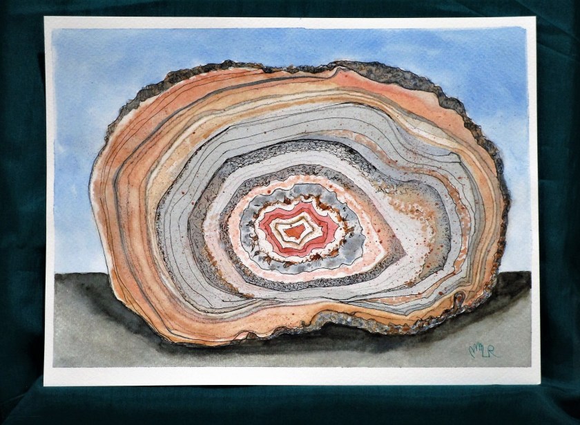
On Sunday I returned to work on the Agate still life watercolor begun in January. (I’ve developed a habit of setting aside partially finished paintings and I’m making a promise to myself to stop doing this.) Here is my last posting:
I found it very soothing to build up the various rings with glazes using matching and contrasting colors. To add more texture, I applied salt to the wet paint in places. After it had dried, I scribbled with a black Prismacolor pencil on the outer layer and darkened some of the rings. To finish, I flecked on spots of copper metallic paint using a toothbrush.
Paints included raw sienna, burnt sienna, quinacridone red, Payne’s gray, cerulean blue and Prussian blue.
The reference photo is found on Pixel and was sourced from the Natural History Museum of London.