Back in May, I started a painting on fabric for the purpose of decorating my patio.
https://wordpress.com/post/dailyfiberfun.wordpress.com/5098
It was May, and the weather for patio-sitting was perfect. But I didn’t finish my painting – I had become obsessed with the Shell Lake Story quilt, and could think of nothing else.
Now that the quilt is finished, AND lovely patio-sitting weather has returned, I got out the fabric paints to work on stage two of the painting.
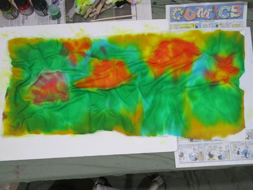
At the end of stage one, I had a 15 by 30 inch canvass with a nice background on it.

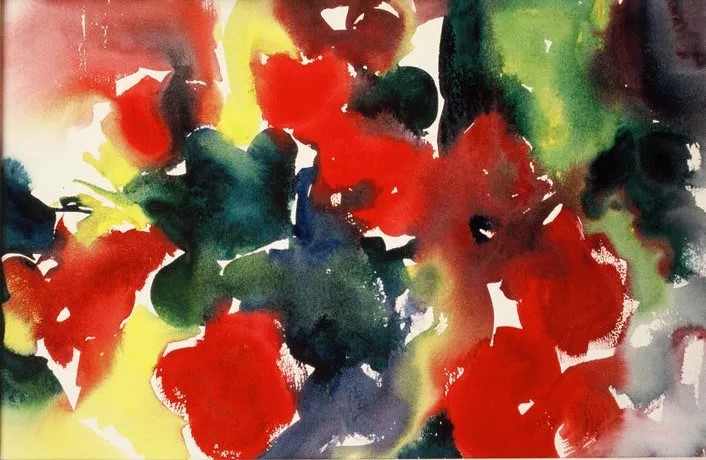
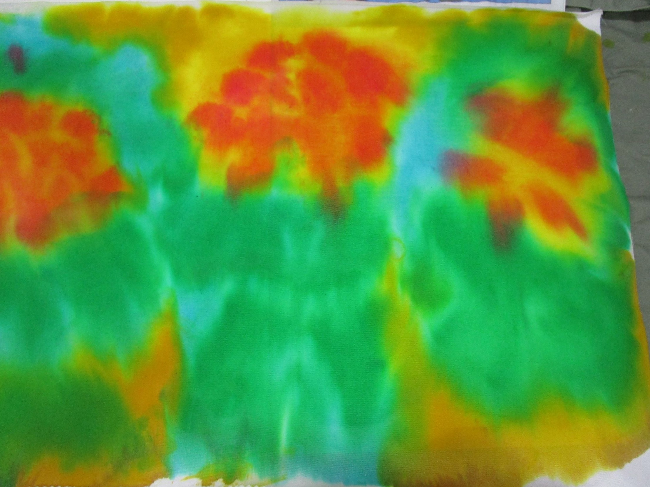
The lovely green-colored folds already looked like geranium leaves. The blank-looking orange blobs will become geranium blossoms.
Using Jacquard Textile paint in colors green, ruby red and goldenrod, I started working from the right side of the canvas to the left. Here is the painting after my first two sessions:

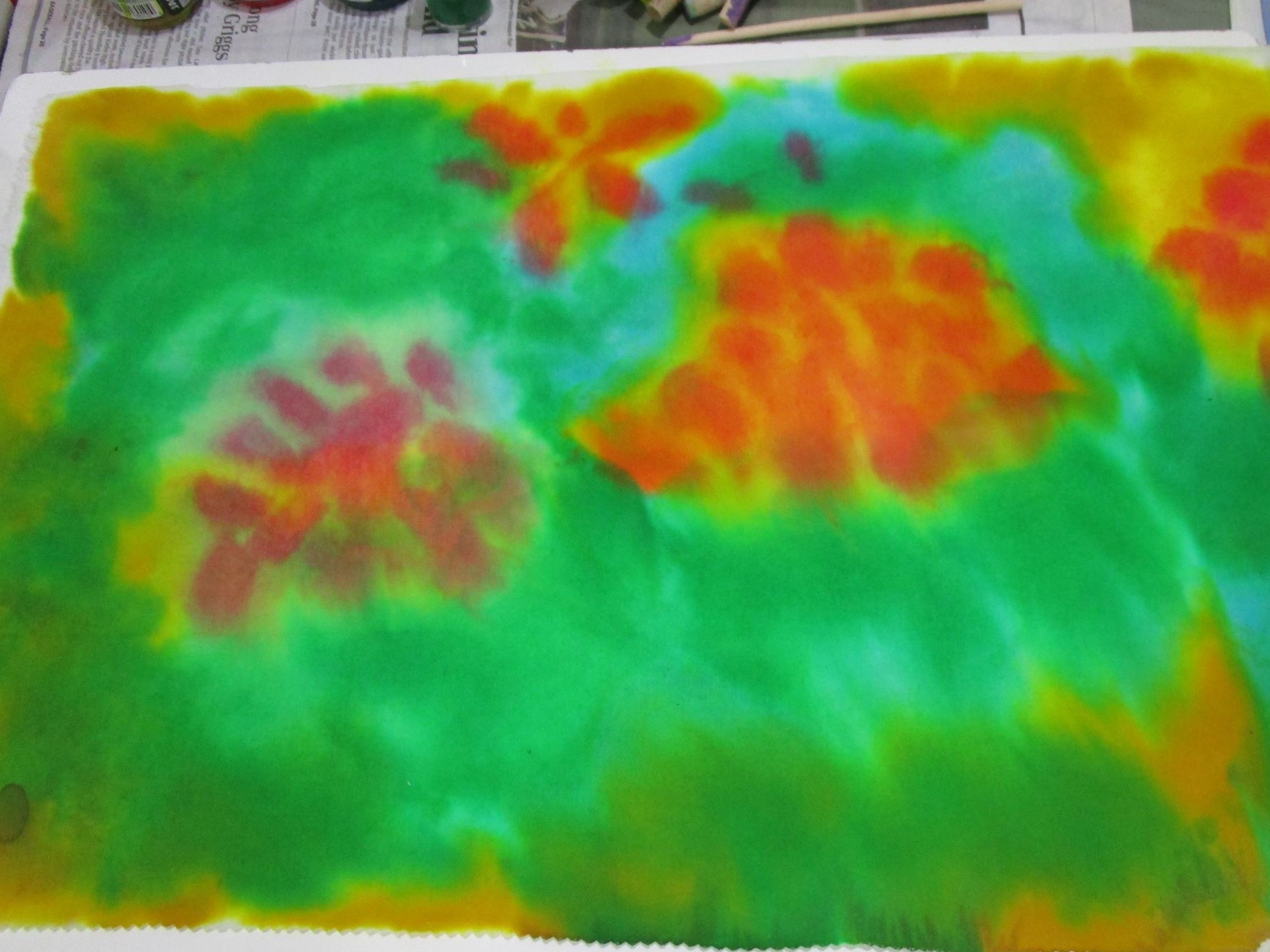
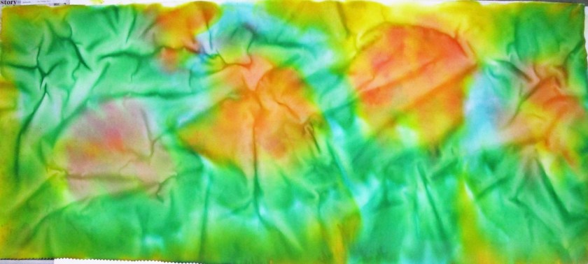
Only one more blossom to go. Today I finished it up,

Hm, it’s pretty obvious that I got better at painting as I went along! While the far left blossom is more carefully painted, it lacks the bright highlights of the first two. This was caused by the tone of the underpainting, which was predominately violet instead of yellow, like the other ones. The only way to fix this is to apply opaque paint. The risk in doing that is overworking the painting.
So I guess I will leave well enough alone.
My next steps are to square up the fabric and staple it to the back of the frame.