Posted in colorwork, painting

Painting the Quilt Backing

On Wednesday I got started with the backing fabric for the Badlands art quilt. It turned out even better than I had expected.

I started with a black-on-white cotton print, which imitates Carrera marble.

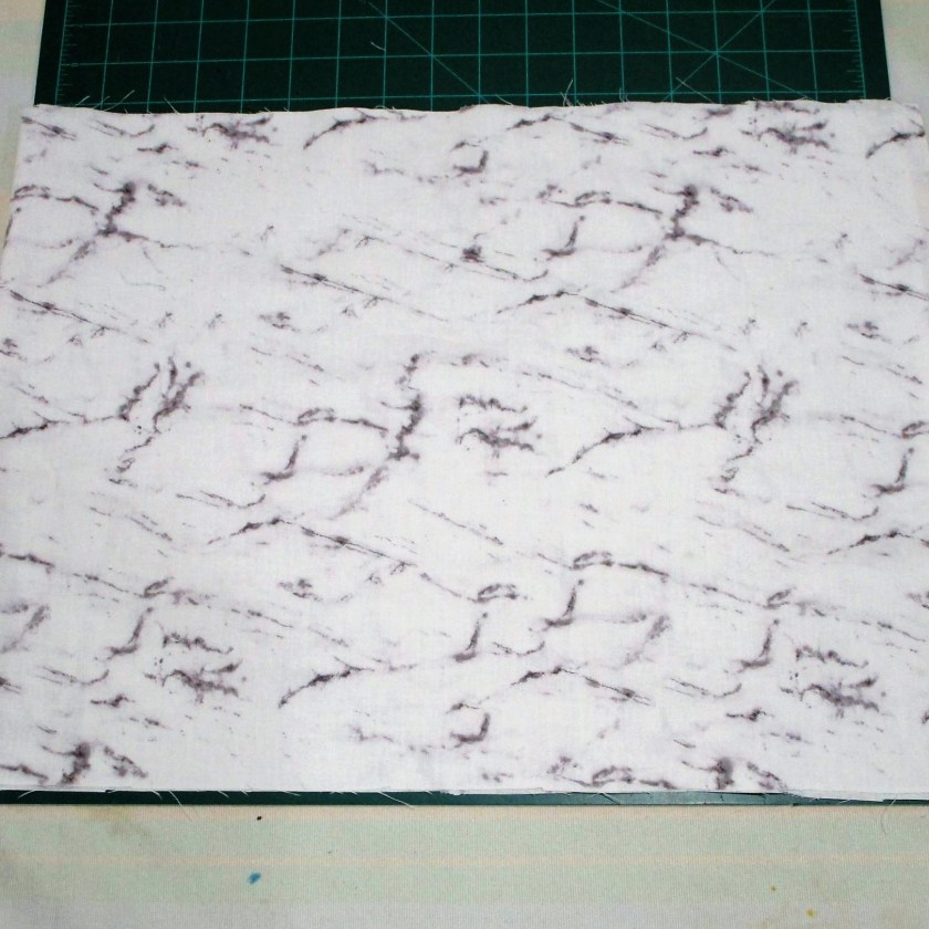
I was drawn to this fabric because it represents a stone product. The veining suggested to me the many cracks throughout the Badlands formations.

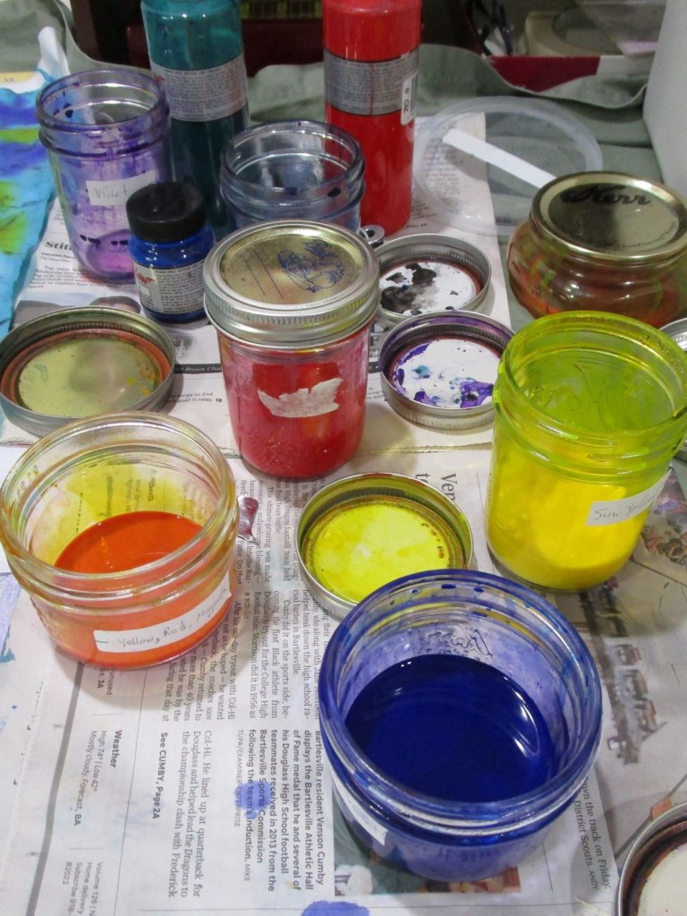
The first step was to achieve a consistent ground color by dipping the fabric into diluted blue-green paint. Squeezing out the excess, I smoothed the piece out onto a large piece of butcher paper. Then using the other paint I had mixed for the quilt front, I applied horizontals bands of color – orange first, then blue-purple. I let the piece sit and slightly dry before sprinkling on rock salt, also in horizontal bands.

AFTER APPLICATION OF PAINT, BEFORE DRYING.

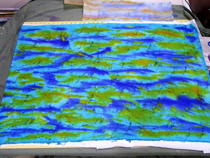
I allowed the paint to dry almost completely before brushing off the salt.

The next morning, I hung it outside to get this photo:

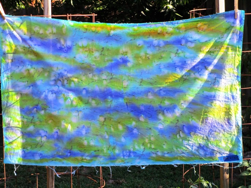
It looks so dramatic, I’m wondering if it will be a waste to use it as a backing.

Earlier today I learned that the batiks I ordered for this project will arrive this afternoon. I can’t wait to see them.

Posted in knitting, painting, quilting

A Couple of WIPs

Yesterday I officially lost at yarn chicken.

AHWWWWWWW!

I have about 16 rounds plus the toe left to knit. Grr. So I wandered through my stash to see if I could find a good substitute and come up with a gameplan.

This morning, entering my studio, I suddenly spied The Swatch. Then I remembered that I had knit two swatches for this project! Both of them included the cream yarn.

SAVED!!!!!!

In other news, I have been painting fabric for the Badlands quilt. Here is a group of color samples in my chosen palette.

I also spent a lot of time simplifying my sketch and making a pattern on freezer paper. This pattern will become the cutting guide for the quilt’s segments. I don’t call them blocks, because they are all different shapes, following the major lines of the subject.

I actually got underway with cutting and sewing some of these segments, starting from the background.

Progress photo.

I’m pretty happy with the work so far. But now I am waiting on fabric to be delivered. In acknowledgement of my rather crude fabric painting skills, I broke down and bought some batik fabrics with colors for the middle ground of the design.

In the meantime, I plan to paint the backing fabric and make the quilt sandwich this week. Then I will be ready to move forward as soon as the package arrives.

Posted in painting

Happy Birthday Bill

Yesterday was dedicated entirely to celebrating my husband’s birthday.

Here we are having a photography adventure at Unity Square park.

I wonder if you can guess his age?

His favorite hobby is taking pictures, especially with the honking big lens affectionately referred to as The Hubble.

Another favorite hobby is fly fishing…………………………………………………………………….

Birthday Card – with apologies to Robert Indiana.

Posted in painting

Shawl Value Study

One more step in learning how to paint this pose

Photograph translated to black and white image

Completed value study, using Paynes gray on Fabriano Studio cold press paper.

I find that the values I painted are very close to the values in the photograph. But I came to the conclusion that there is insufficient contrast among the mid-tones.

So I will be “pushing” these tones when I paint the image in color. I think I will leave the contrast between the two shawl colors the same, but paint the background tones darker overall.

And maybe it’s time to get out the Arches paper.

Posted in painting

Color Study

I’m interested in doing a few watercolor portraits. Today I am studying this photograph that I took of my daughter wearing a shawl I knit.

I chose this because of the variety of textures and contrasting values. Her pose is also very interesting to me.

So far, I have cropped the image and penciled the shapes onto watercolor paper. But before jumping into painting, I thought I would test out a few color selections in my sketchbook.

Some good options

A good start. The background is not dark enough, but I like the shawl colors. I can add more layers of paint to the background. That hair is too orange! It will be useful to attempt another study of the head before I move on.

8-05-22

Today I corrected values, added detail to the background and refined the face.