Posted in colorwork

Salty Squares Disaster

I’m feeling pretty low right now. Here is my colorful tale of woe. Maybe talking about it will help me feel better.

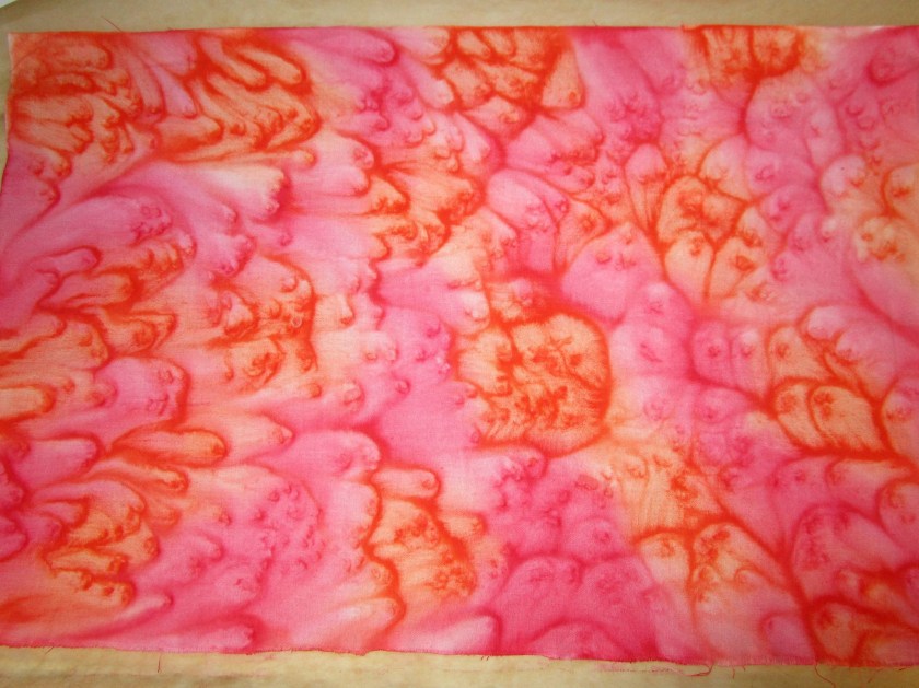
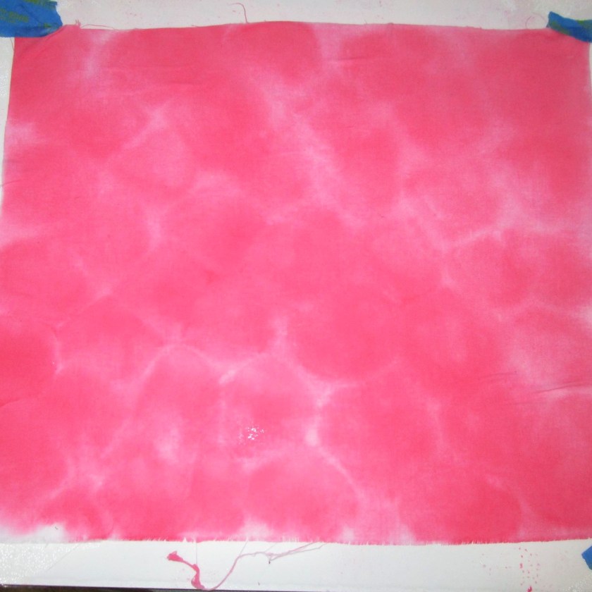
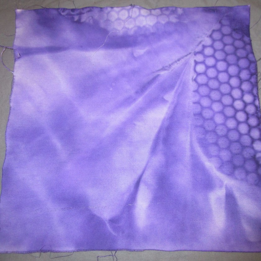
After I finished my two swatches yesterday, I could tell that the two patterns would not go well together in the same quilt square. The patterns were both the same scale. So I decided to make two additional color wash pieces – one in dark purple, to pair with the light patterned swatch, and one in pale pink, to pair with the dark patterned swatch. They turned out great – the colors were just what I wanted.

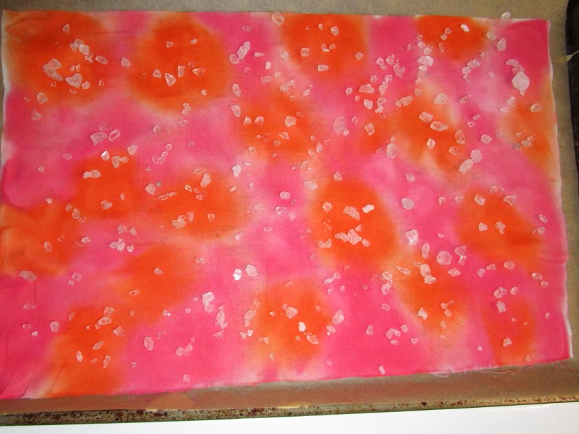
Oh, by the way, I also hand-washed the two salted pieces which I made yesterday, to remove the salt. At this point, all four pieces were drying. As they were nearly dry, I decided to toss them into the electric dryer, briefly, just to speed things up.

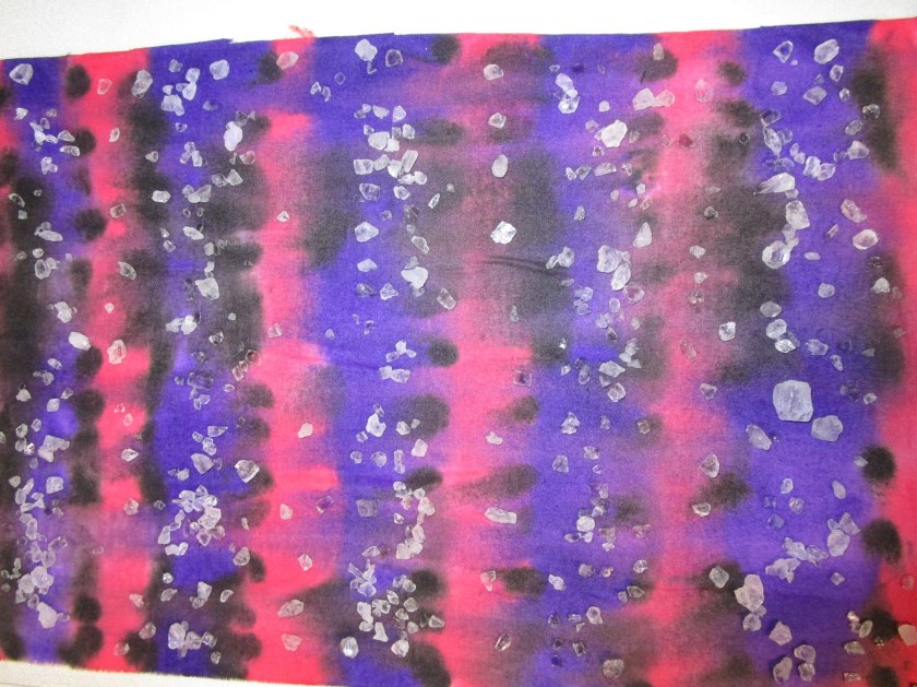
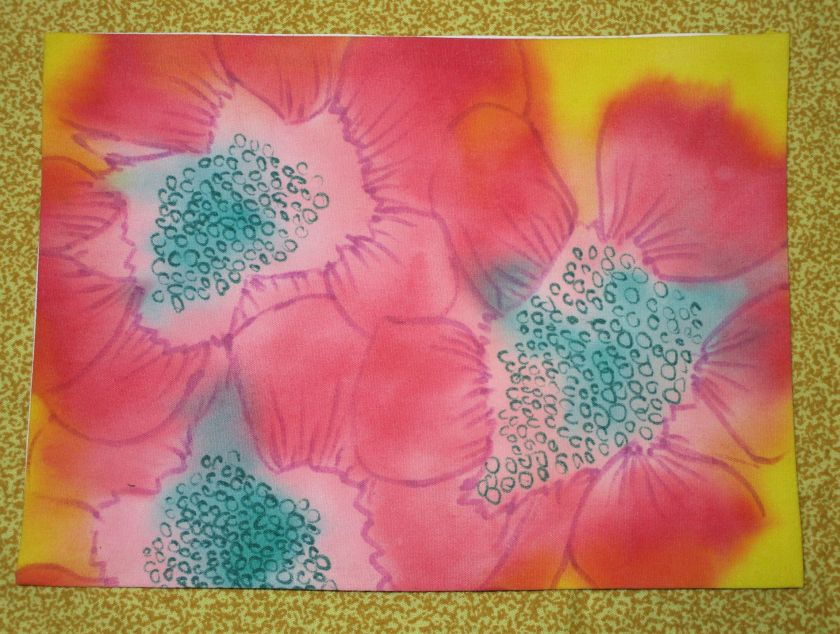
You’ve probably guessed what happened next. I returned to the dryer, and found purple paint everywhere. The purple swatch was clinging to the dryer exhaust vent grill and now looked like this:

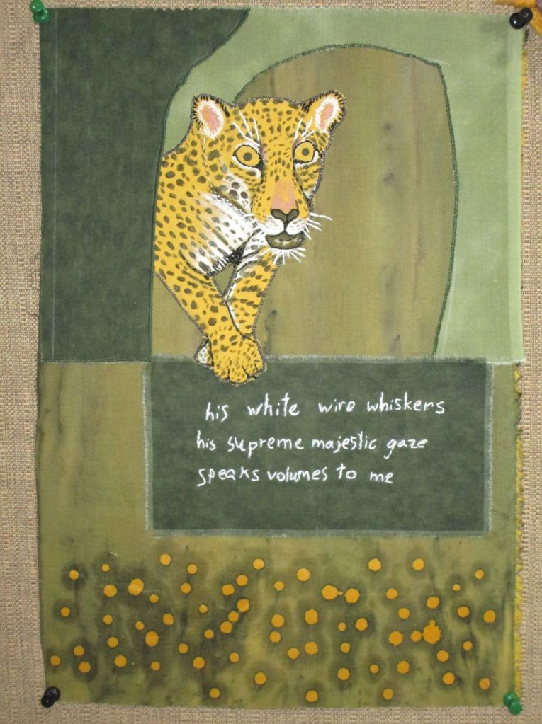
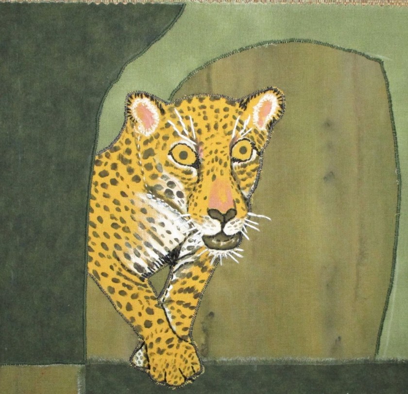
The pink and the light color printed swatch had dots of purple all over.

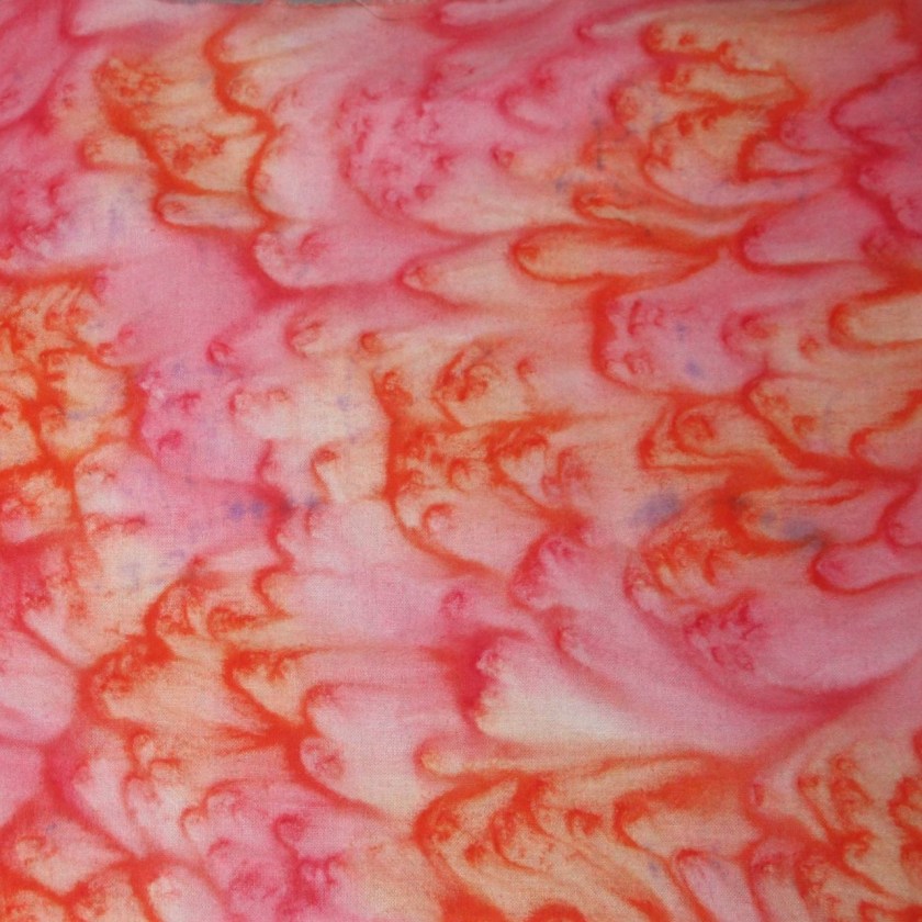
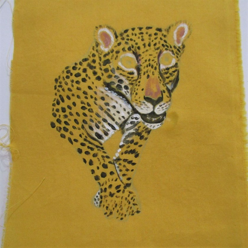
Only the dark-colored print escaped harm. I will spare you the view of purple disaster inside my dryer. Fortunately, I was able to remove all the paint from the dryer walls by wiping them down with a wet towel. But I have now lost enthusiasm for sewing up nine-square patches today.

Let’s see, what aphorism can I use for this situation? “We learn from our mistakes?” “What doesn’t kill us makes us stronger?” I know – how about. “I’ll think about that tomorrow. After all, tomorrow’s another day.” So true, Scarlett my dear. So true.

Posted in colorwork

Salty Squares

Rain, rain rain. It just doesn’t want to stop. So today I decided to stay indoors and play with my Dye-Na-Flo paints again. The goal is to color up some fabric that can be sewn into a nine-patch quilt square. Thinking about the design principals of using light, medium and dark colors to create good design, I chose pink, orange and white for one swatch, and pink, purple and black for the other swatch. I will use the salt technique on top of the color washes. Salt has the effect of moving the pigments around in the drying phase. So here are my before and after photographs:

Light colors after painting, with rock salt sprinkled on top.
Light swatch after drying, salt removed.
Dark swatch after painting. I used broad stripes, then moved the paint side-to-side before sprinkling with the rock salt.
Dark swatch after drying.

Due to the damp weather, it took all afternoon and the application of a little blow-dryer heat to get the fabric dry. But what interesting results have happened!

Next time, I cut the patches and sew.

Posted in colorwork, hand embroidery, sewing

Haiku illustrated

So here is what has happened since you last checked in with the haiku project. I have transferred the image of the jaguar to fabric.

Using Jacquard Textile paint, I added the features and spots to this beast.

Next I hand embroidered the details, including eyes, ears, mouth, paws and whiskers.

Here are the fabrics I chose, in the general layout I wanted.

The next step was to embroider the haiku onto the dark green rectangle. It was important to me to replicate Henry’s handwriting as well as I could. I enlarged the original on the printer. Using chalked paper, I traced over the letters to mark them on the fabric. Then I embroidered the letters in white floss.

Finally I appliqued all of the pieces to the background fabric, machine-stitched around the raw edges, and embroidered the last few white whiskers on the cat. Here is the piece in its current state:

Henry’s Haiku

And here is a final close-up of the jaguar.

My original goal for this piece was to illustrate Henry’s poem, and to practice embroidering hand writing onto fabric. At the outset, I never expected to paint the fabric so much. But I’m glad I did it. I learned more about how to apply paint to fabric. And I ended up with a colorful and meaningful piece of fabric art.

Posted in colorwork, hand embroidery, quilting

Vigil Scene Part II

This is the completed work of the Easter Vigil scene. I know that the subject matter is not for everyone. But I am particularly happy with this fiber object. In the first place, I was able to control the color application in order to get the result I was aiming for. The character of the marble wall in the darkened church is much as I remembered it. The statue has the ghostly quality that matched the atmosphere of the moment. And the rendering of the little dancing candlelight reflections almost capture the way they appeared to me. It would seem not possible to render the shimmering character of the reflections in this media.

I used cotton muslin, candle wax, Jacquard Dye-Na-Flo paint, Pebeo Setacolor opaque paint, hand stitched with cotton and metallic floss, machine quilted.