Posted in collage, painting

A New-to-me Design Tool

When it comes to my painting practice, I have been in a months-long drought. While knitting like a demon, I have not been inspired to paint, either on watercolor paper or fabric, since the completion of the Oregon Native quilt in early August.

That ended after reading a post by Just Sketching, in which he describes a compositional tool that blows the “rule of thirds” completely out of the water. It is called the Harmonic Armature. This tool takes the rule of thirds to the next level. In the rule of thirds, the designer/artist divides the picture plane into three more-or-less equal parts, both horizontally and vertically. The goal is to organize the major elements to intersect one or more spots where the lines cross.

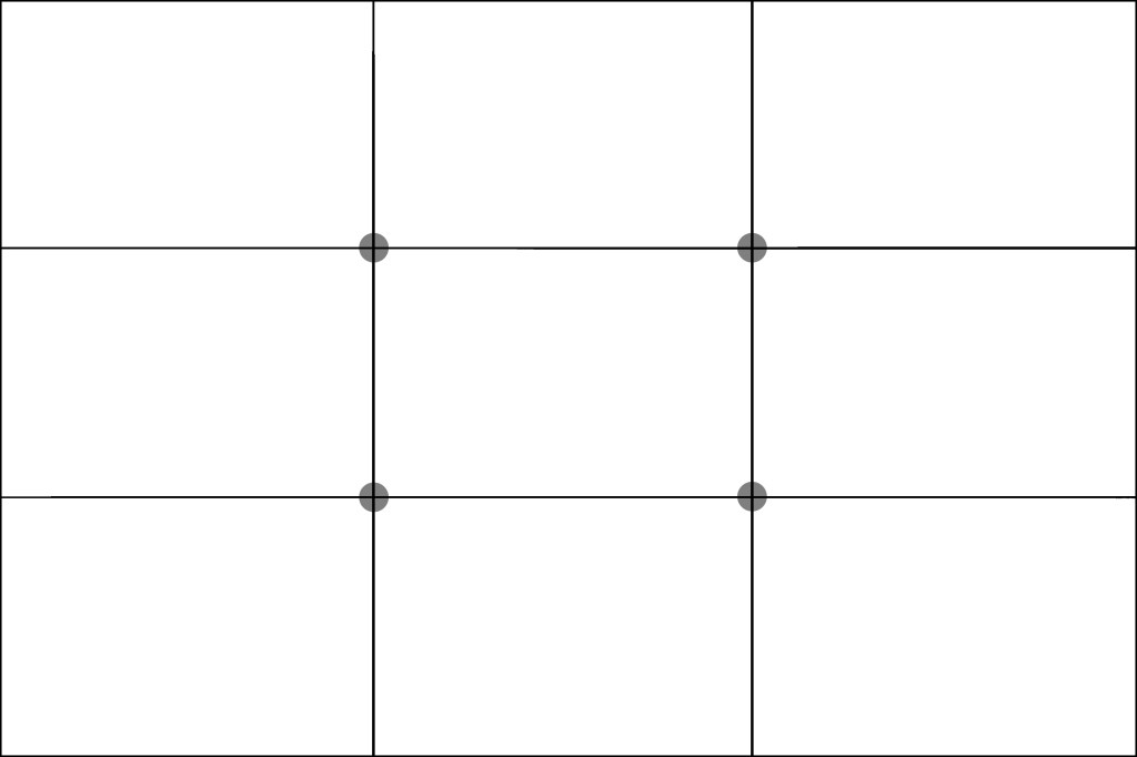
I have no trouble understanding and using this rule, but I always am left with questions about how best to lay out the rest of my composition.

Now look at the Harmonic Armature

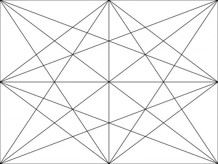
The four dots are clearly visible, but there is so much more. To get an idea of how this tool is used, have a quick listen to this video by Diante Jenkins.

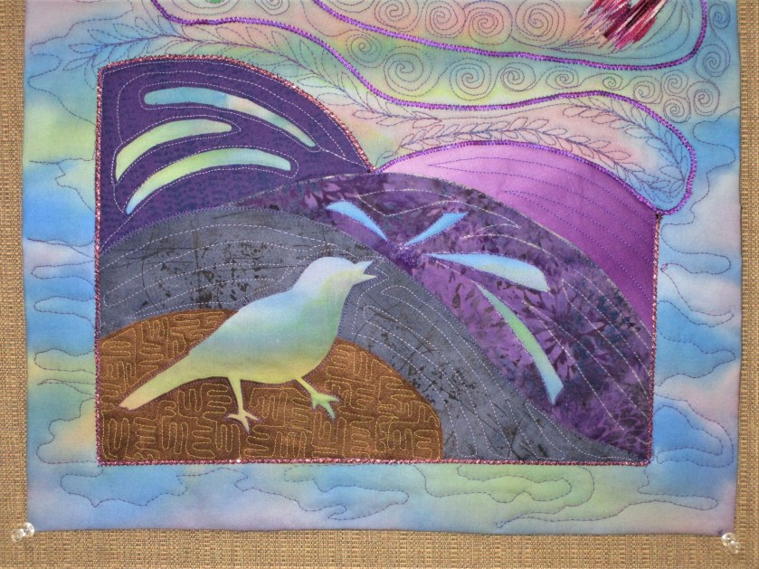
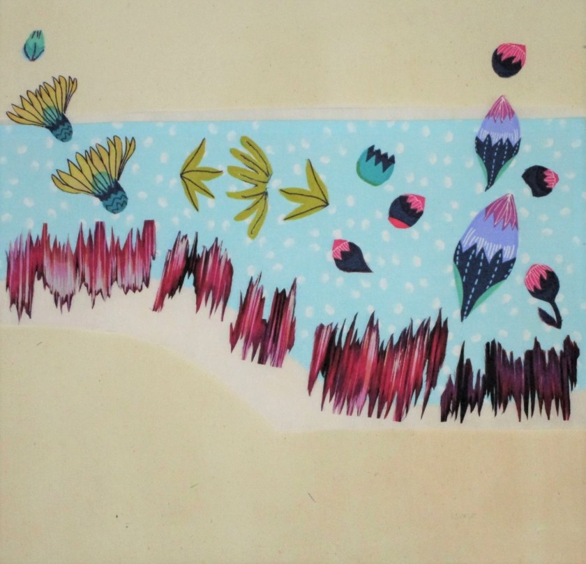
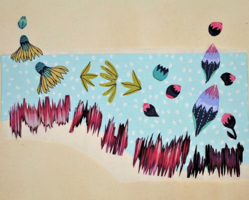
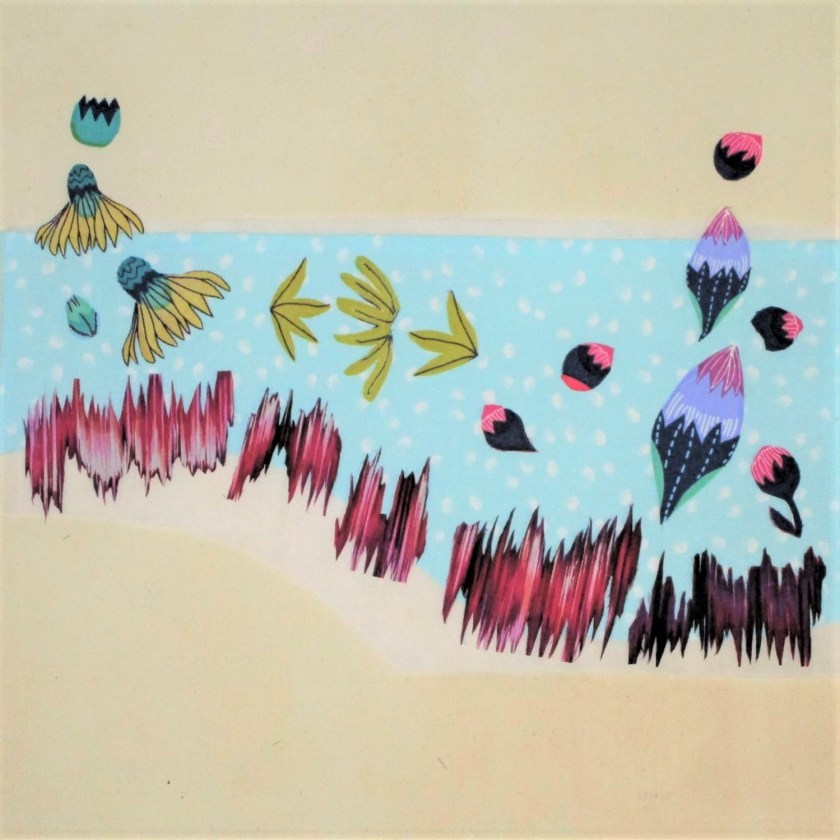
I had to try this right away, so I started searching through some of my old paintings. I found one based on an excellent photograph that I did five years ago, in my early days working with watercolor paint.

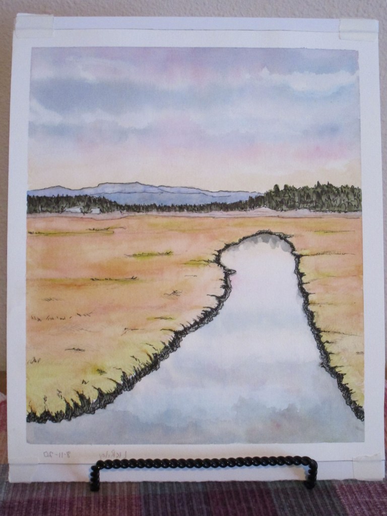
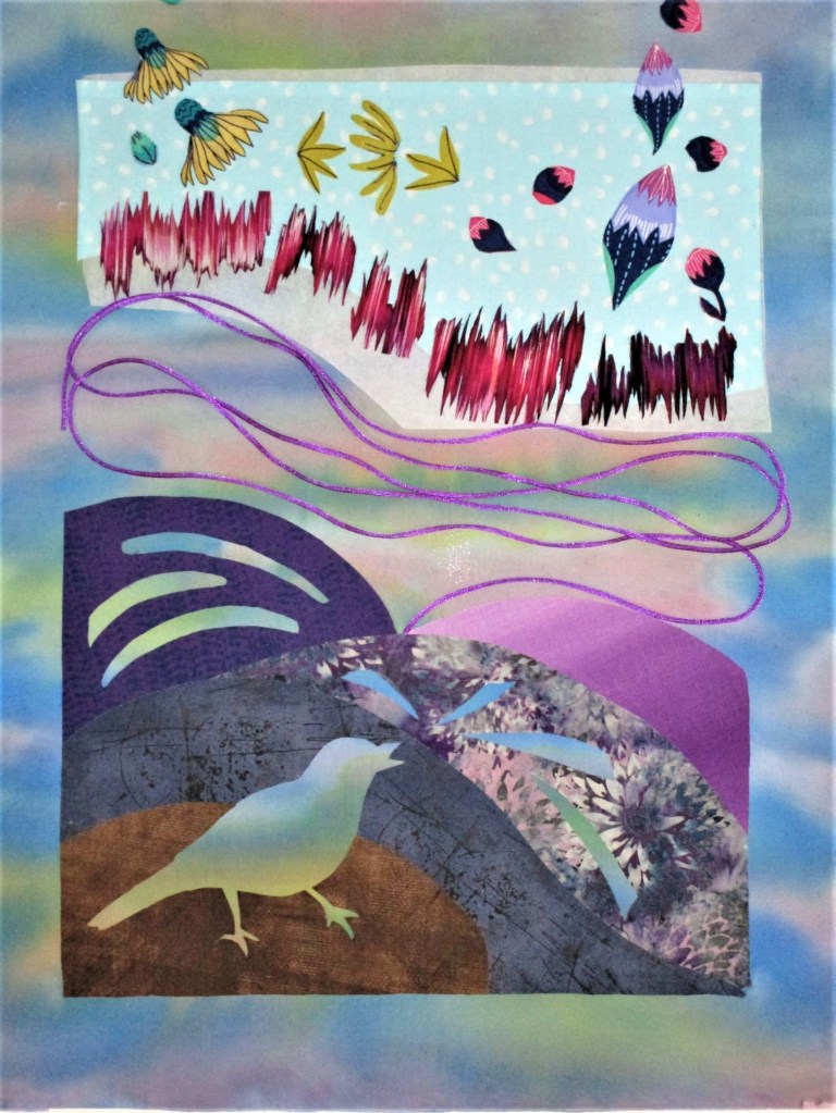
I like how it turned out, but it always struck me as too empty. This past summer, I took it to a workshop I attended on making transfer prints with a laser jet printer. I transferred a photocopy of the painting to a cradled plywood board. Then I didn’t know what to do with it . I decided to add collage to it. What it needed was something alive – like birds. But where to put them?

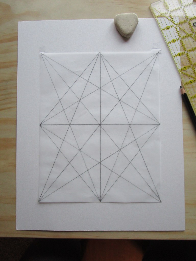
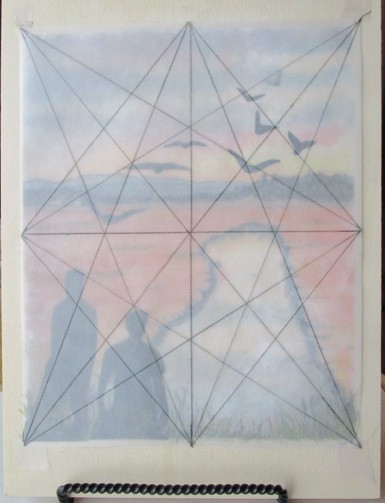
First, I drew the HA on an 8×10 piece of tracing paper.

Next, I thumbed through some magazines and cut out various shapes of birds in dark colors. I also found some silhouetted figures in the magazine, which could work in my new design, so I cut these out.

After taping the armature over the print, I carefully slipped my cut-out shapes into place, taking advantage of the converging lines and focal points visible on the tool.

Once the glue dried, I added a few colored pencil marks to blend the silhouettes with the foreground.

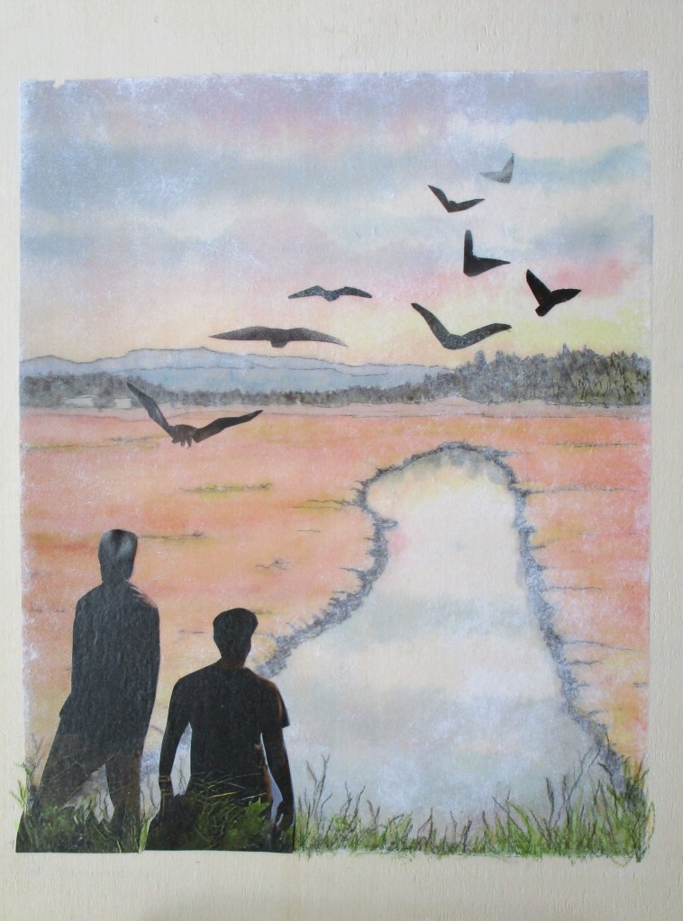
It was a delightfully spent afternoon.

Now I am keen to get out my unfinished watercolors and see how I can move them to the finish line inspired by my new tool.

Posted in collage, painting, quilting

Friday Finish: Badlands

The inspiration for this art quilt came to me during our trip to Roosevelt National Park in July of 2021. I was captivated by the sandwich layering of rock, running in parallel lines that eroded down over thousands of years. It suggested to me a string pieced quilt. For the next several months I thought about my concept and puzzled over how I could bring it to life in fabric.

Our photographs were disappointing. It was high noon, and pervasive smoke dulled the light. No shadows were in evidence and the colors were muted. I decided to rely on an internet image for my working reference photo,

Photo from vangorentalmn.com

To get from concept to finished art is a long process. I started by making a value sketch. Next, I drew a pattern to scale, identifying major segments and eliminating excessive detail.

Here’s the part all fiber artists (including myself) find extremely creative: choosing fabrics. Since I like to use watercolor, I painted my swatches. After assigning a hue and value to each segment on my pattern, I picked out the fabrics to best achieve my color scheme of orange, blue-purple and blue-green.

Here’s an aside about the fabric I chose. Ultimately, I couldn’t find fabrics that had the colors and textures that I needed. To get there, I painted on printed fabric for most parts of the quilt. I also selected a few batik prints that were close enough, with only minor adjustments to color.

With the design decisions made and fabric selected, I began to assemble the quilt. All of the techniques that I used in making this quilt I learned from two fiber artists: Annette Kennedy and Gloria Loughman.

http://annettekennedy.com/about

https://www.glorialoughman.com/about

I thank these artists for giving me the skills I needed at the time I needed them.

And here is Badlands in its final form:

The design is invigorated by lines running in parallel diagonally and horizontally. Where the diagonals meet, triangles are formed. These shapes lead the eye to the center where two focal points have a quiet conversation across the river valley.

As a final note, I want to acknowledge the influence on my style of pop artist David Hockney. A print of his painting, Garrowby Hill, hangs over our fireplace.

My imagination has traveled that blue road countless times over the past twenty years.

Posted in collage, painting

Fun Fabric Object Friday

The email came in with the following request from my sister-in-law:

Our dear niece is getting married this May. The couple had said “no gifts,” but we want to make them a joint patchwork bedspread from all of the family. Would you be willing to make and send a six by six block that will be incorporated into this gift?

Would I? Without a doubt. But I needed more information to make it personal. I asked, “What are the hobbies and interests of the happy couple?” When I heard the answer (the bride loves ballet and the groom is fond of dogs, especially his collie, Harvey,) an image came to mind immediately:

Dog in tutu !!

My sister-in-law had sent a photo with the fabric palette. (See above.) All I needed was some similar fabrics and a reference image.

DONE

The first step is to convert the photo to black and white, print it and make my edits.

Next I traced it, used the tracing as a pattern, and cut out each pattern piece. The pieces were attached to fabric treated with fusible webbing, cut out, and then fused to a piece of raw silk. Using Jacquard Textile paint and the reference photo as my guide, I painted the collie’s fur and features. Black micron pen rendered his little face beautifully. (sorry, I have no photos of these steps.)

Here is my block after the fusing and painting were complete.

Ballerina Collie after assembly

I chose a light color background fabric in a cotton damask. It’s no coincidence that the background fabric was left-over from a bed spread that I made several years ago.

For final touches, I machine-stitched all the edges, added a few ruffles to the tutu with pale peach thread and brushed in some metallic paint for the crown.

Ballerina Collie Completed

This will go into the mail on Monday, along with a few extra pieces of fabric, which the patchwork makers may find useful.

Whimsical and fun. So satisfying to make. I hope that the recipients are pleased.

Posted in collage, embellishing, quilting

Catbird Sings Reveal

In his Guide to Birds, David Sibley describes the gray catbird’s song thusly:

” …a rambling, halting warble with slow tempo…low hoarse notes with high sharp chips and squeaks interspersed….little repetition and little mimicry.”

…..which is, while accurate, a rather dry and technical explanation for what I heard that day:

Catbird Sings

In my final arrangement of this fiber object, I ditched the blue fabric which I was going to use as a framework for the “notes and chips.” Instead, I let the purple satin cord act as a highway for the eye to travel to each vocal outburst. I also unified the color of the lower section by overpainting the batik print using violet.

Close up of bird hidden in purple shrubbery

The free motion stitching wasn’t overly planned. I mostly just followed the clues given by the appliques and the color changes in the background.

Upper section finished with closely spaced stitching and pearlescent paint

I hope you enjoy “seeing” this catbird’s song, as much as I enjoyed listening to it.

Posted in collage, quilting

Wednesday WIP – Art Quilt

Yesterday I spent some time working through the design and material choices still facing me with regard to “Catbird Sings.” I settled on the arrangement for the lower half of the work, tacking it into place. The violet satin cord will serve as a transition device linking the lower to the upper half of the piece.

It will be couched into place when I start sewing. Next I chose and cut out various bits and bobs from two printed fabrics to represent his varied “cat calls”.

The colors all link well to the palette chosen. The wavy lines will represent the loud squawks. Before proceeding to the next steps, I treated all the edges with Fraycheck.

Those wavy pieces in particular will shred massively if not treated.

I was ready to test some layouts for the upper half:

I like this grouping. But do I use the daisies with petal sides up……..

….or petal-side down. Hmmmmmmm….. I like the line created by the upside daisies.

TENTATIVE FINAL ARRANGEMENT

And here is how I left the work. Before I finalize, I will need to decide on how I will quilt all of the different sections. It won’t do to fall in love with a layout and then struggle to quilt around it.

I’ll sleep on it and see how I feel the next day.