One of six children, I was raised by a busy mom, who instilled in me a love of fabric. Though I learned to sew and knit at a young age, it was the arrival of my first grandchild that pushed me into action. A long-time knitter, I am now ready to explore all things fiber.
After my latest experience in watercolor painting that yielded (to me) disappointing results, I decided to sign up for a tutorial. I reasoned that it would give me some pointers on realistic shadows and rebuild my confidence in painting.
Shari Blaukopf has a new course that teaches painting spring flowers. This will be my fourth or fifth tutorial with Shari, so I knew what to expect.
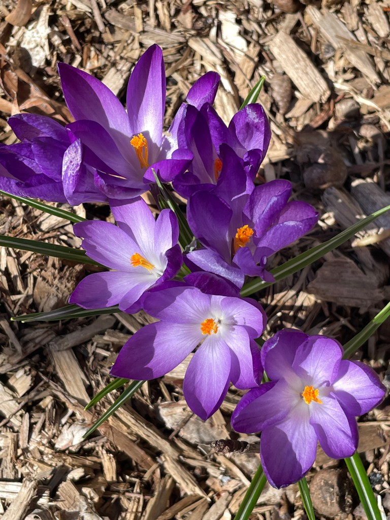
The first lesson is crocuses. Shari chose a perspective that it dramatic and not hard to do. Her reference photo was taken looking straight down at a group of flowers just opening up.
COPYRIGHT SHARI BLAUKOPF
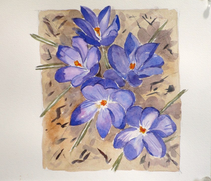
I jumped right into the lesson, sketching it yesterday and painting it today.
Maybe I could have made my cast shadows darker.
This exercise was fun and relaxing. The palette I used incuded cobalt blue, quinacridone magenta, hansa yellow deep, transparent orange, carbazole violet, burnt sienna, ultramarine blue and yellow ochre. Paper is Arches cold press, 140 weight.
After I finish the next two lessons, I’ll go back and try painting my Admirable Weeds subject again.
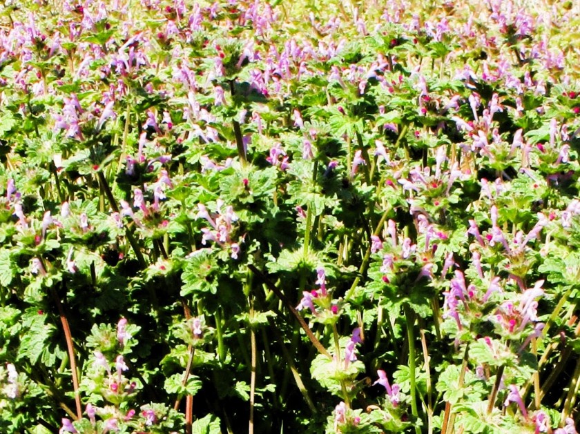
My inspiration for this painting happened during a camping trip to Kansas in late March. At the site, I noticed a dozen or so Red Admiral butterflies floating around an open area near some trees. After following them around for awhile, I realized that they were taking nectar from two weedy non-native plants: henbit and dandelions. My thoughts went something like this: Those two plants are disdained by gardeners and the general public. Yet one of our most beautiful native butterflies found them attractive. There is something to be valued here that I wish to explore.
The henbit was lush and blooming profusely.
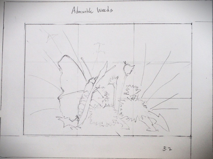
I grabbed another photo in my backyard, which I used to create my drawing.
For the butterfly reference, I went to Unsplash.com for this lovely by Don Coombez.
Reference in hand, I started work, first by testing colors in my sketchbook.
Next came a pencil sketch which was transferred to Arches cold press paper.
Stages of the painting:
Masking fluid applied and Initial wash laid down.
First round of colors dropped in.
Foreground painted and additional layers added.
Masking fluid removed, some shadows and details painted in.
Finished up by adding highlights and cast shadows.
I’m relieved to have finished. These complex organic scenes are still very difficult for me. And while I can’t say I love every bit of my painting, I did achieve my objective.
Earlier in the week, Quilting Gail had let me know that my name was randomly selected to receive a door prize for participating in this year’s Stay At Home Round Robin quilt challenge. I was thrilled to learn that the prize was Aurifil thread! Of all the gifts that were sponsored this year, the thread was the one I had my eyes on. I’ve been wanting to try this superior brand of thread for several months now, ever since a certain big box store discontinued offering its line of quilting thread – I’m pointing at you, Hobby Lobby!
The Necessities House Collection includes four neutral shades ranging from white to black. For piecing one’s quilt, this covers all the colors that one would need to get the job done. I can’t wait to try it out in my Bernina machine.
So here is my shout out to Gail and her cohorts for organizing the challenge.
And here’s my shout out to Aurifil for its generosity in sponsoring SAHRR 2024.
To see the quilt I made for the SAHRR 2024 challenge, click here.
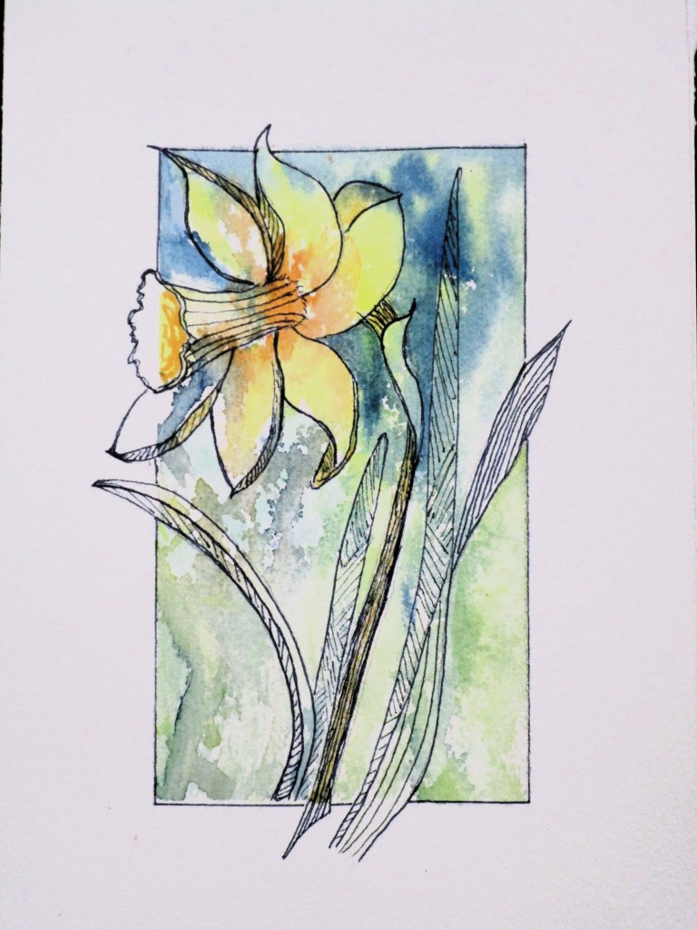
There was quite a crowd at today’s Open Studio. Cheryl Bryan decided that this session would be focused on playing with our paint. She brought examples of daffodils rendered in a stylized fashion using watercolor and pen.
Watercolor painted and photographed by Cheryl Bryan
I have been struggling with painting lately, so it was very therapeutic for me to let go and try stuff. Here is my 3 by 5 1/2 single daffodil based on the reference image.
After making the drawing with pencil, the panel was taped off and splashed with water Three colors were selected, dropped on the wet paper and encouraged to run. I used Winsor yellow, transparent orange and Prussian blue.
The paint was allowed to dry, then additional paint worked in, mostly around the edges and into the background. After drying thoroughly, the tape was removed and lines worked over the painting. I used a dark blue Micron pen. It was fun to let the elements of the image slip outside the border.
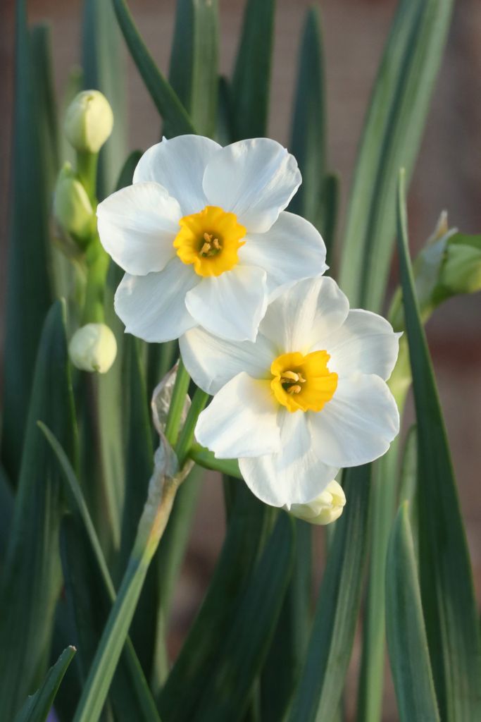
Next, I pulled out one of Bill’s photographs. He loves shooting images of the daffodils in our front yard. This variety is called geranium. They have tiny clusters of three or so flowers topping each plant.
copyright Bill Riley
Using the same technique, I worked these cuties in a cool palette of carbazole violet, quinacridone magenta and Prussian blue.
I intensified the color in the short trumpets with some watercolor pencil in gold and dark magenta.
Despite the crowded room, I ended the session feeling relaxed and confident. Now I am ready to return to a slightly bigger painting that I have started, which features a butterfly and some spring weeds. Stay tuned.
To see some of Cheryl’s gorgeous watercolor paintings, you can visit her website:
This is the week that Quilting Gail has designated for challenge participants to post pictures of their finished quilts. The Stay At Home Round Robin challenge is in its fourth year. It’s been a fun ride for me, and pure pleasure to see the work of other quilters as they add a border week by week.
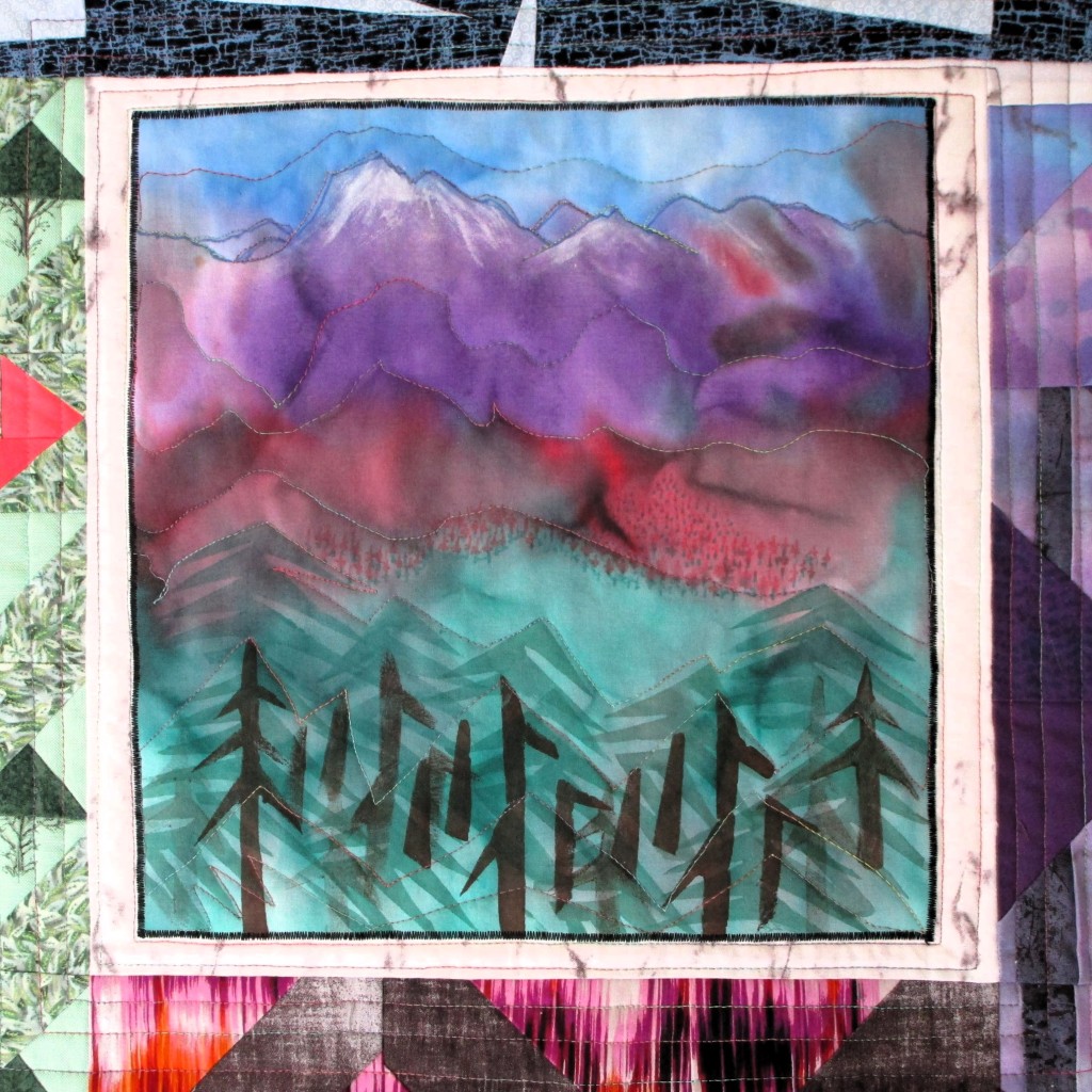
It started for me when I chose a center block from a group of experiments that I did almost five years ago. Back then I was teaching fiber arts to a group of home-schooled children. One week I had the students experiment with fabric paint on pieces of a cut-up sheet. The panel I used in my SAHRR came from the example I made, to show the students some of the possibilities of fabric paint.
Four colors of paint were applied in bands horizontally across the fabric and allowed to bleed together. When the panel dried, it looked like a mountain scene to me. I enhanced the image with opaque white paint, paint pens and stencils of pine trees.
The painted panel set the color palette for my SAHRR.
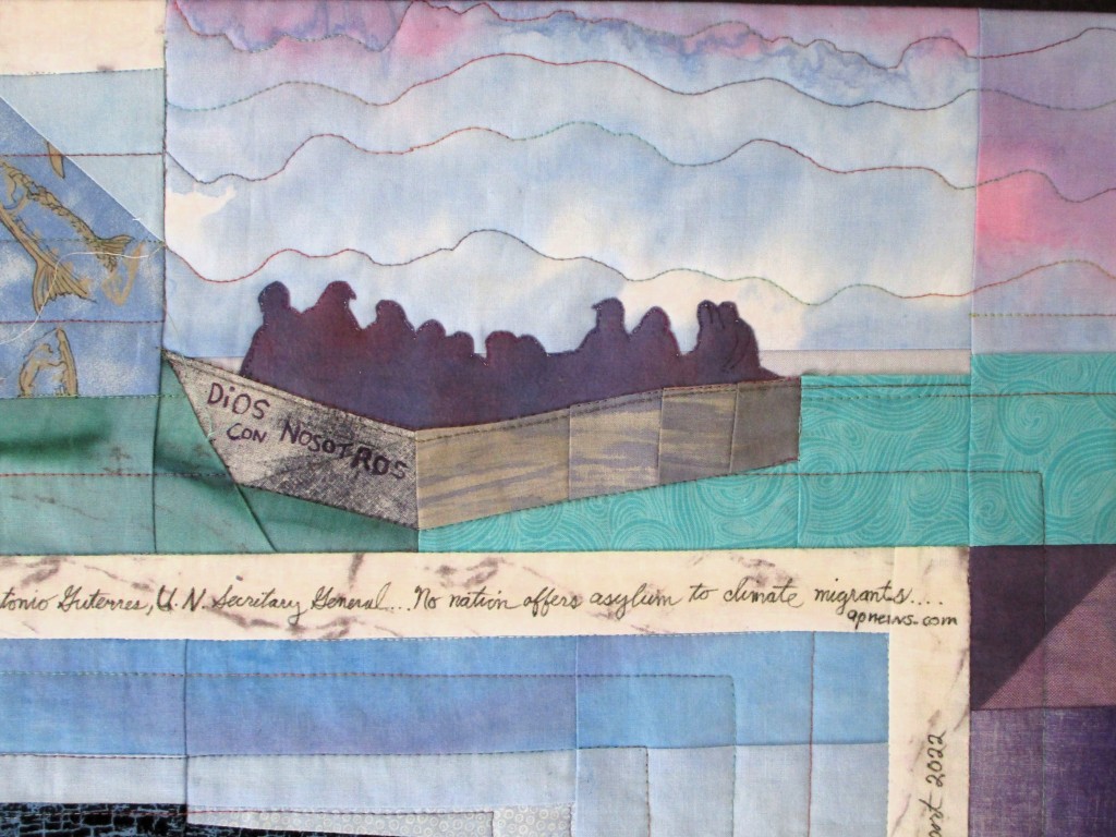
That choice led me on a path which resulted in a quilt about migration. For some time, I had been toying with designing and sewing paper pieced butterfly blocks. Could I make a quilt about the monarch annual migration to Mexico? The time I spent researching this migration led me to think about the wider issues of habitat loss and climate change. Now I had a broader story to tell with my quilt.
The weekly challenges offered by SAHRR quilters helped me to build some structure around my ideas. For that I am grateful.
Here are some close-ups of a few details I added with applique and micron pens.
And here is my finished quilt:
Just a word about the materials used: I was determined to buy nothing for this project, making it entirely with stuff that I already owned. I mentioned the cut-up sheet. In addition, I recycled pieces of clothing such as dresses and men’s shirts. The main fabric, which was used as sashing, was also divided up and painted various colors to carry it into most of the borders. Ultimately, I did have to buy a few quarter yards of black patterned fabric and the quilt’s batting.
Thank you to organizer Quilting Gail and her fellow designers who put together this year’s SAHRR challenge. You can find their work here: